All photography by Saana Hellsten
Basik
Research, Concept Design, Branding, Packaging Design, Product Design, Service Design, Photography
New york, USA

Basik was born as the result of my thesis based on gendered visual language. The thesis criticises packaging that perpetuates gender stereotypes and sees gender-neutral packaging as a factor that can encourage gender equality and create a more sustainable world.
The name Basik refers to neutrality. I am digging into the basics of the products and leaving out the extra, such as the unnecessary gendered visual language. The project shows how the same gender-neutral solutions, when done well, can work throughout an entire product range.
My thesis is based on examining gendered visual language as a tool for communicating an attribute of a product and as a means of conveying the intended target audience of a product. I explore the former by taking a look at regular household products, while the latter I analyse by focusing on personal hygiene products.
The written part of the thesis can be seen after the BASIK project


The household products
In household products it is clear that gendered visual language carries heavy symbolism. Masculine design is often used in products that are perceived to have stereotypically masculine characteristics, such as power and effectiveness. Soft and sensitive products use feminine visual language instead.
By utilizing these stereotypes, traditional attributes of men and women are being enforced when I feel that we should do the opposite.
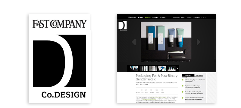
"Packaging For A Post-Binary Gender World"
– Fast Company

The razors
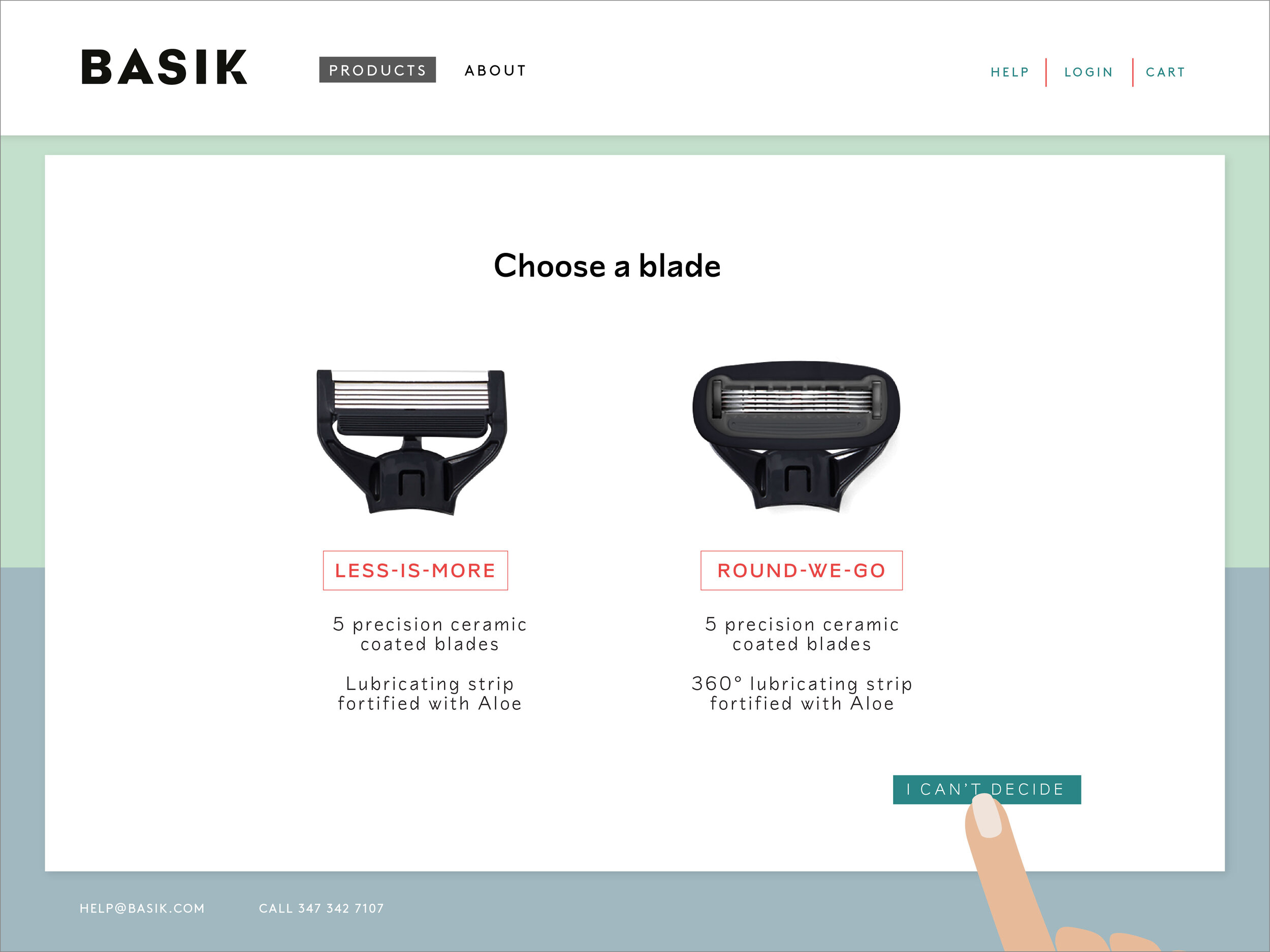
On the other hand, shaving products, such as razors and shaving gels, use highly gendered visual language in order to communicate which products are marketed for men and which for women. I learned that there in fact are some physical differences in the razors for men and women, but these differences are related only to the function of the product, not necessarily to the gender of the consumer.
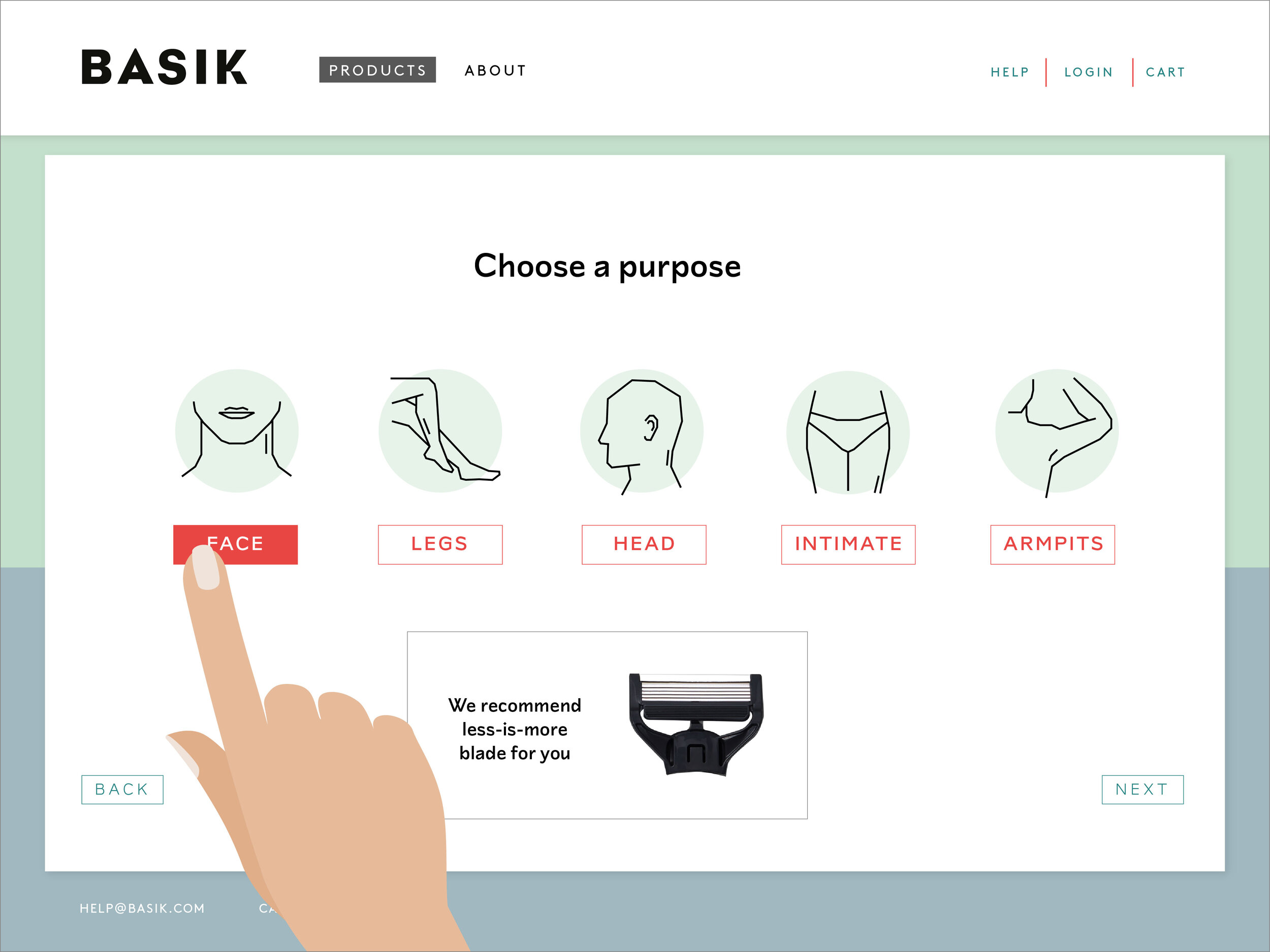
For example, there are different blades for shaving a beard than for shaving legs, but this doesn’t mean that the potential target group of the product consists of one gender. Similarly, the packaging design of shaving gels is highly gendered, although the purpose of the product is usually the same regardless of the consumer; to make the skin smooth.
BASIK strips away the gender from the packaging of shaving goods and instead focuses on the function
– Trendland

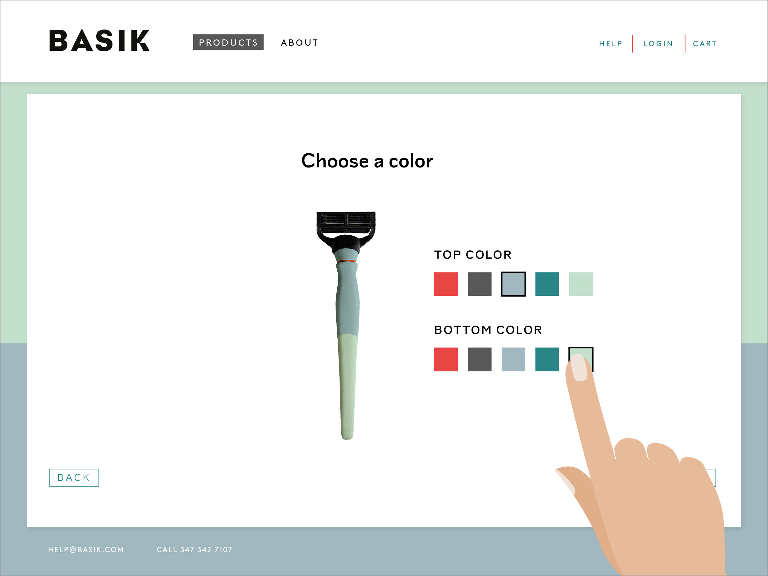
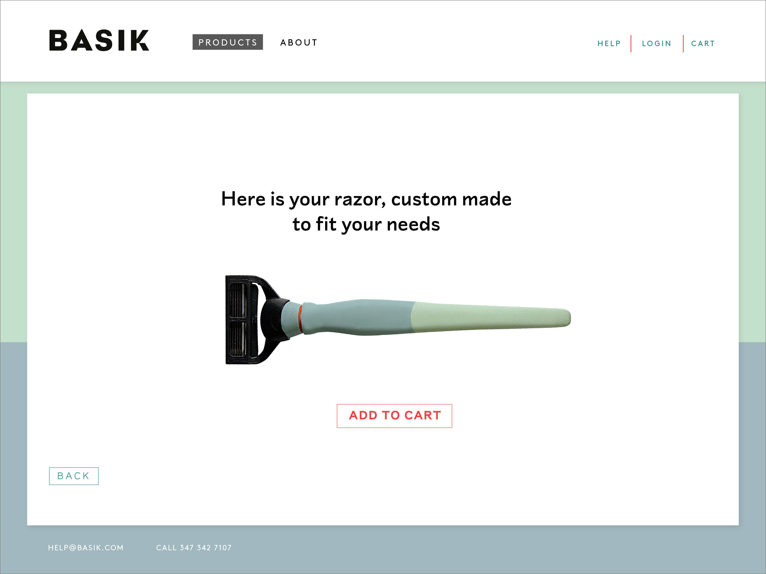
Heroing individualism & function
Designing Basik, I created a unified identity to all the products, which removes gendered design from the products. In the household products the focus is on stackability and modularity.
The personal hygiene projects focuses on individuality. It gives the consumers the option to choose the razor & shaving lotion based on its purpose and need, not the gender of the end user.


The visual identity
The label design uses the rules of less-is-more. It is simple and unified throughout the products. The information is minimal, which directs the attention into the most important factors. The icons show the purpose of the product and help the consumer find the right product in a fast and uncomplicated manner.
The color palette of Basik was formed by conducting a survey in which the participants chose their preferred colors from sets of three, consisting of a masculine, feminine and neutral color. The logo is simple and straightforward with a detail in the letter K.

Few selected press


Photography by Saana Hellsten
Creating a society open to diversity through gender neutral design
Research, Graphic design, Strategy
New York, USA
I received my Master’s Degree in Package Design from Pratt Institute, New York, in the Fall 2014. This is the written part of my thesis ”Creating a society open to diversity through gender neutral design”.
The stereotypes of women and men are very strongly planted in to our minds already in our childhood. The visual language that surrounds us has a big impact on how we perceive things, because objects are not passive; instead, they powerfully influence the way we behave. People use objects as symbols that communicate status, intentions, personality, and culture, and thus objects affect the ways in which people react to each other. The most basic aspect of a product, the function, is lost in the run of making more profit.
Packaging design is our first interaction with the product and our current packaging design perpetuates gender stereotypes – something I want to change. I believe designing gender-neutral packaging will encourage gender equality and will create a more sustainable world.
To tackle this topic, I looked into the history of gender roles and stereotypes and the effect of colors have on us based on our gender. I analyzed the gendered visual culture and how marketing and branding are done for men and women.
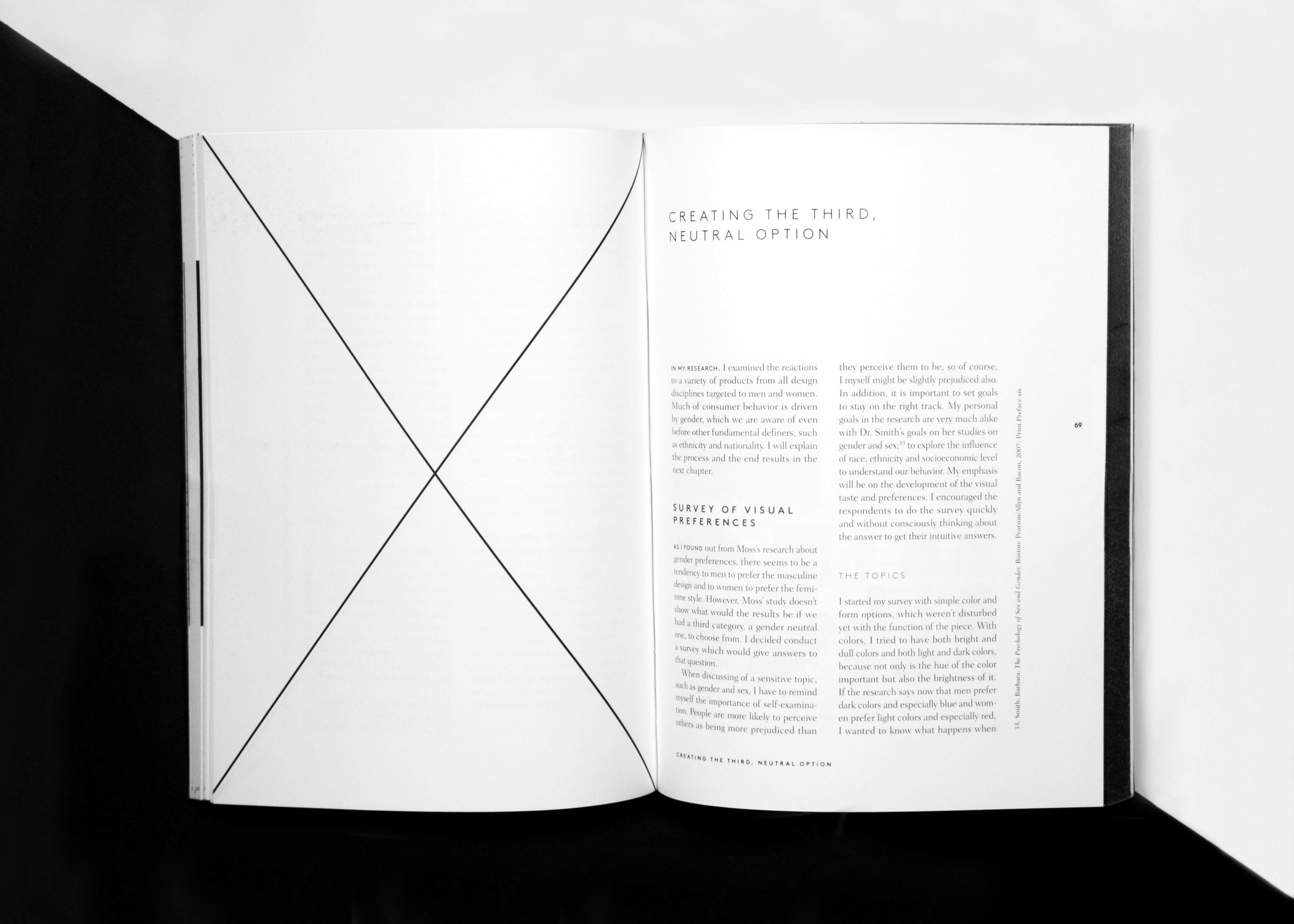
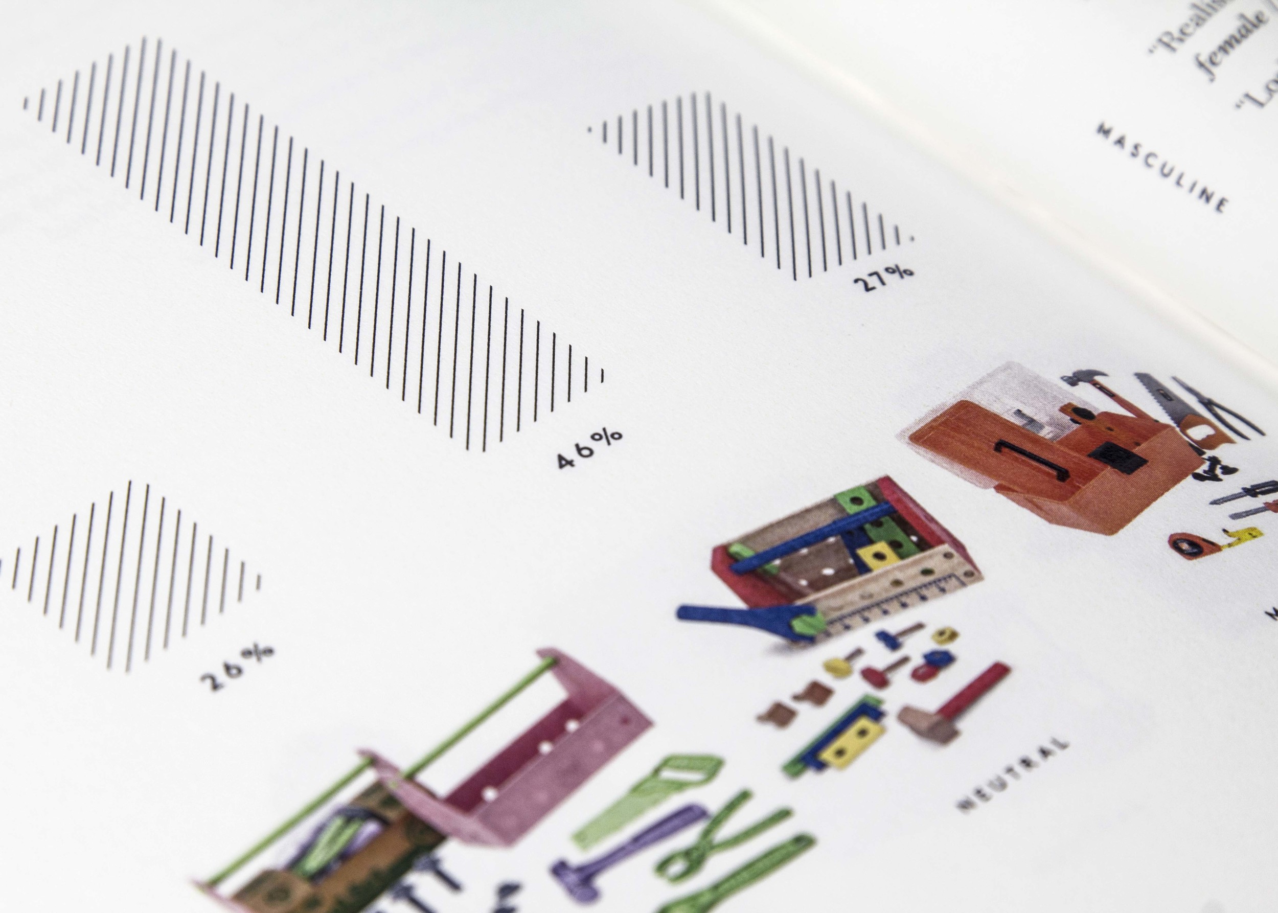
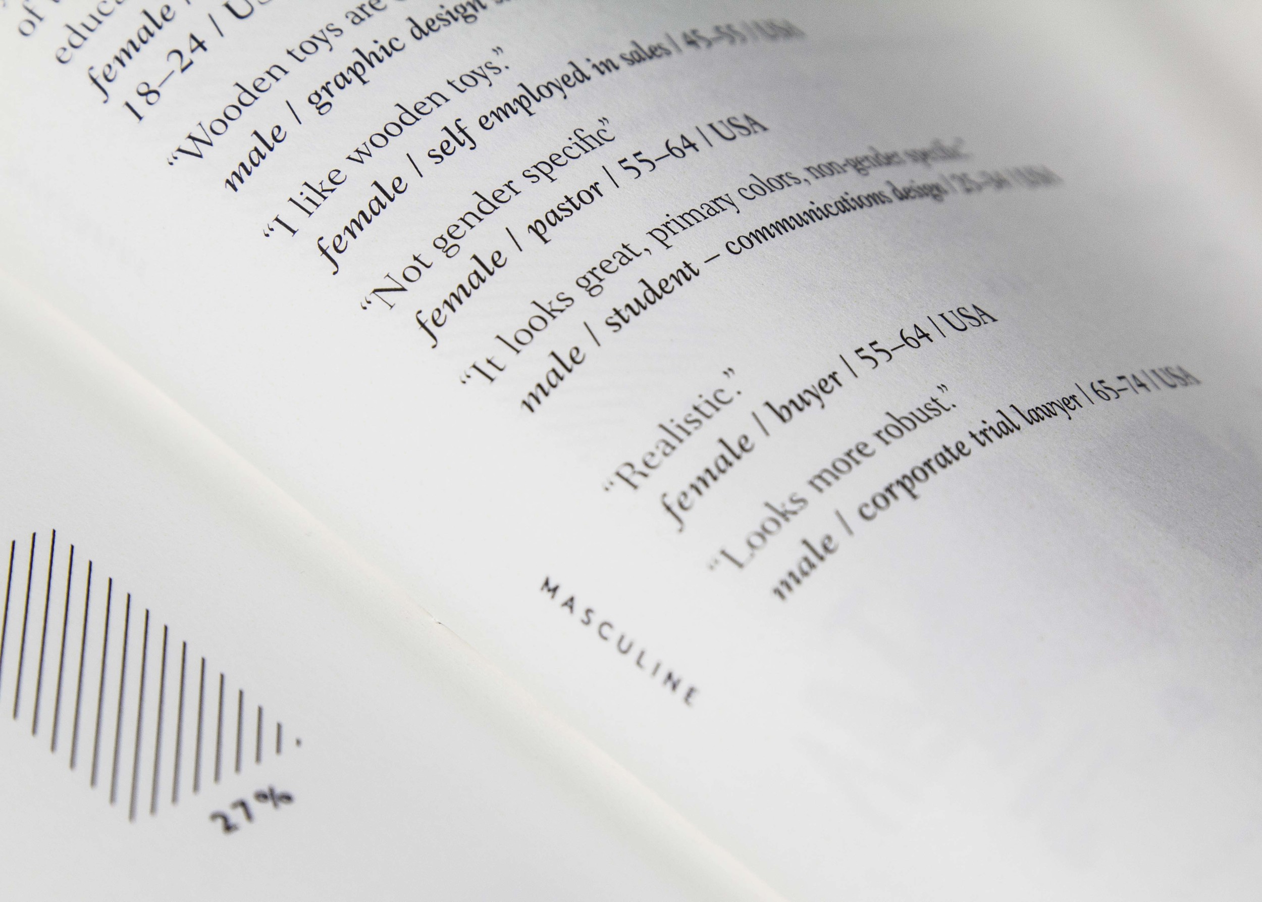
After a thorough background research, I created a survey, where I studied people’s visual preferences now. I gave them a feminine, masculine and a neutral option in changing, random order, to see which one they would prefer and why.
I got over 400 responses on the survey. The results of the survey and the research led to a project called BASIK, which examines gendered visual language as a tool for communicating an attribute of a product and as a means of conveying the intended target audience of a product. I explore the former by taking a look at regular household products, while the latter I analyze by focusing on personal hygiene products.


The illustrations are made by Anssi Mattila.